System Components
Account Pages
System Settings
Themes
The Themes component allows you to create and customize themes based on your branding and color scheme.
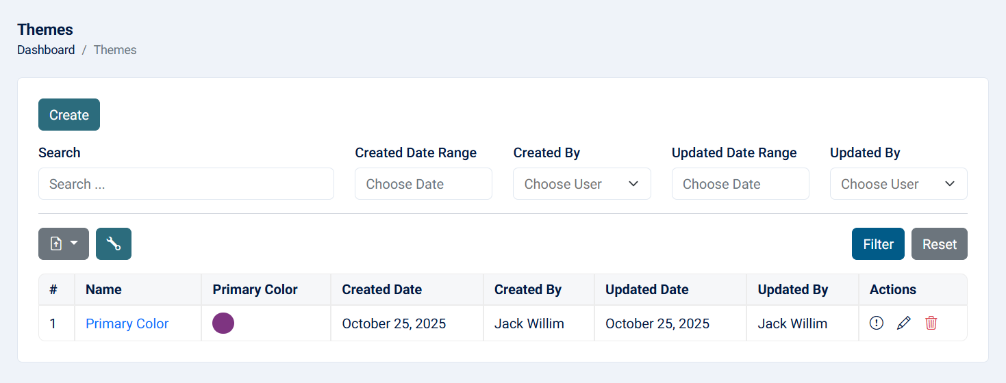
1- List: This page displays all records of the component, with options to customize the view and export the data.

Read more about the list page and how to customize the table through this link.
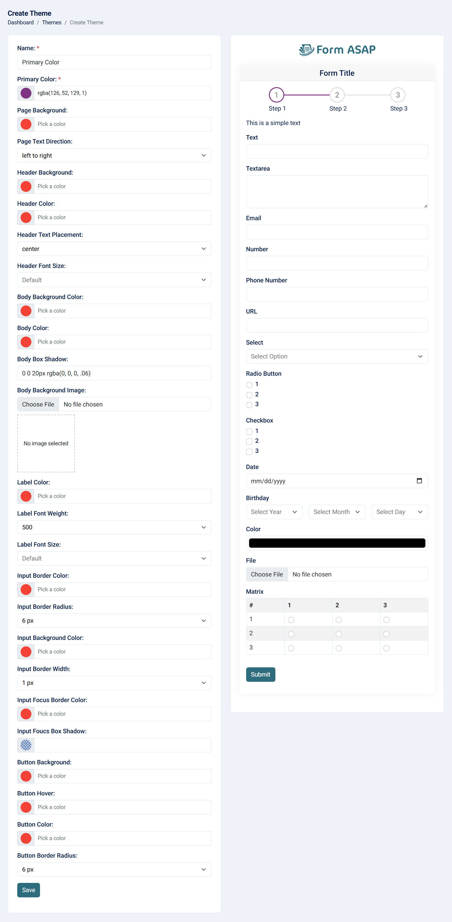
2- Create: This action allows you to design a theme using predefined fields to easily set their values. The Custom CSS field for full control over the theme's appearance.


- Name: The name of the theme (required, maximum of 255 characters).
- Primary Color: Used for the step circle and line color (required).
- Page Background: Changes the entire background color of the page.
- Page Text Direction: Allows you to choose left-to-right or right-to-left text direction.
- Header Background: Sets the background color of the title.
- Header Color: Sets the text color of the header background.
- Header Text Placement: Allows you to choose the text direction of the title (left, right, or center).
- Header Font Size: Changes the font size of the header.
- Body Background Color: Sets the background color of the area where the fields are set.
- Body Text Color: Sets the text color of the area where the fields are set.
- Body Box Shadow: Adds a box shadow to the body. You can remove it, but ensure to add a border using custom CSS for better UI/UX.
- Body Background Image: Adds an image instead of a background color. Note that the overlay will be applied automatically.
- Label Color: Changes the label color of each field.
- Label Font Weight: Changes the weight of the label to make it normal or bold.
- Label Font Size: Changes the font size of the label.
- Input Border Color: Changes the color of the input border.
- Input Border Radius: Changes the radius of each input.
- Input Border Width: Changes the width of the input border.
- Input Focus Border Color: Changes the color of the border when the user focuses on the input.
- Input Focus Box Shadow: Changes the color of the box shadow when the user focuses on the input.
- Button Background: Changes the background color of the button, typically the primary color.
- Button Hover: Changes the color when the user hovers over the button.
- Button Color: Changes the text color of the button.
- Button Border Radius: Changes the radius of the button. For better UI/UX, ensure the input and button have the same radius.
- Custom CSS: Allows full control over changing the theme. Note that this will be applied after the default elements, which means if you want to change default input values, they will be affected.
Note: Custom CSS is only available on the Pro plan.
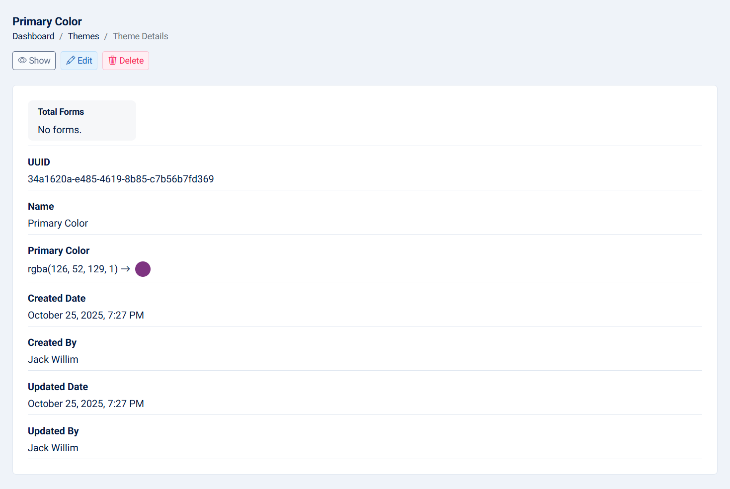
3- View: This action allows you to see the theme details.

- UUID: The UUID of the theme.
- Name: Name of theme.
- Total Forms: The total forms count related to this workspace.
- Primary Color: The primary color of the theme.
- Created Date: The created date of the theme.
- Created By: The creator of the theme.
- Updated Date: The updated date of the theme.
- Updated By: The person who updated the theme.
4- Edit: This action allows you to edit the theme.

- Name: The name of the theme (required, maximum of 255 characters).
- Primary Color: Used for the step circle and line color (required).
- Page Background: Changes the entire background color of the page.
- Page Text Direction: Allows you to choose left-to-right or right-to-left text direction.
- Header Background: Sets the background color of the title.
- Header Color: Sets the text color of the header background.
- Header Text Placement: Allows you to choose the text direction of the title (left, right, or center).
- Header Font Size: Changes the font size of the header.
- Body Background Color: Sets the background color of the area where the fields are set.
- Body Text Color: Sets the text color of the area where the fields are set.
- Body Box Shadow: Adds a box shadow to the body. You can remove it, but ensure to add a border using custom CSS for better UI/UX.
- Body Background Image: Adds an image instead of a background color. Note that the overlay will be applied automatically.
- Label Color: Changes the label color of each field.
- Label Font Weight: Changes the weight of the label to make it normal or bold.
- Label Font Size: Changes the font size of the label.
- Input Border Color: Changes the color of the input border.
- Input Border Radius: Changes the radius of each input.
- Input Border Width: Changes the width of the input border.
- Input Focus Border Color: Changes the color of the border when the user focuses on the input.
- Input Focus Box Shadow: Changes the color of the box shadow when the user focuses on the input.
- Button Background: Changes the background color of the button, typically the primary color.
- Button Hover: Changes the color when the user hovers over the button.
- Button Color: Changes the text color of the button.
- Button Border Radius: Changes the radius of the button. For better UI/UX, ensure the input and button have the same radius.
- Custom CSS: Allows full control over changing the theme. Note that this will be applied after the default elements, which means if you want to change default input values, they will be affected.
Note: Custom CSS is only available on the Pro plan.
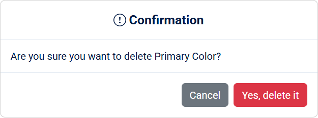
5- Delete: The delete action allows you to remove a theme. When a theme is deleted, any forms assigned to that theme will be reassigned to 'not set'.

Note: This action cannot be undone.
