System Components
Account Pages
System Settings
Forms
The Forms component allows you to create and manage forms.
1- List: This page displays all records of the component, with options to customize the view and export the data.
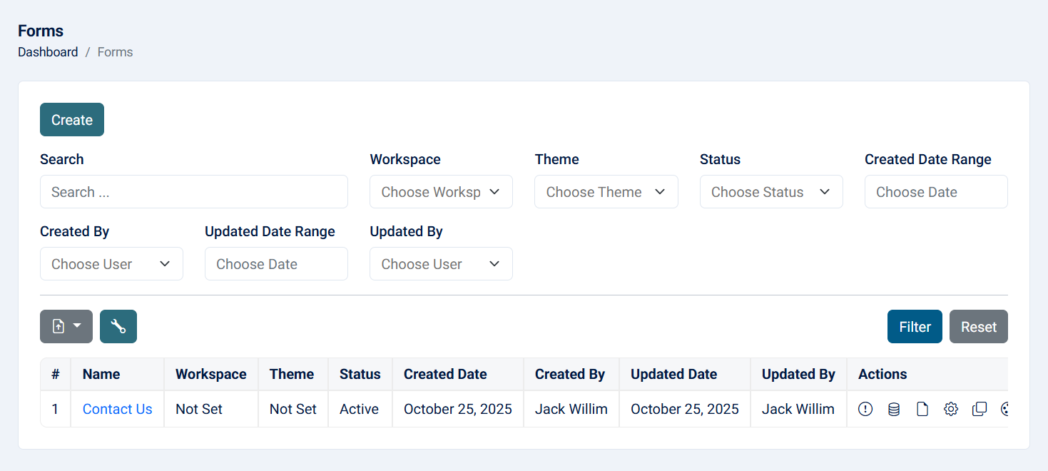
Read more about the list page and how to customize the table through this link.
2- Create: This action allows you to create a form.

- Name: Enter a name for the form (required, maximum of 255 characters).
- Main Langague: The main langague of the form (required).
- Category: Optionally assign a category (configurable in system settings).
- Theme: Optionally assign a theme (configurable in system settings).
Upon creating a form, you will be redirected to the form designer to add fields. Each field have custom settings. After adding the fields, click on save, then view the form to see the form.
3- Form Designer: This action allows you to design the form with various fields and create a multi-step form by adding pages.
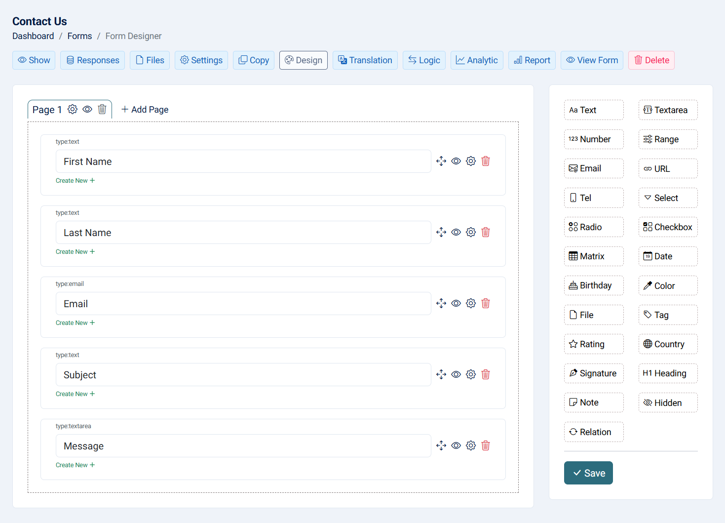
Read more about each field and their settings through this link.
4- View: This action allows you to see the most important form details in addition to generating the QR code for both the slug and the generated URL.
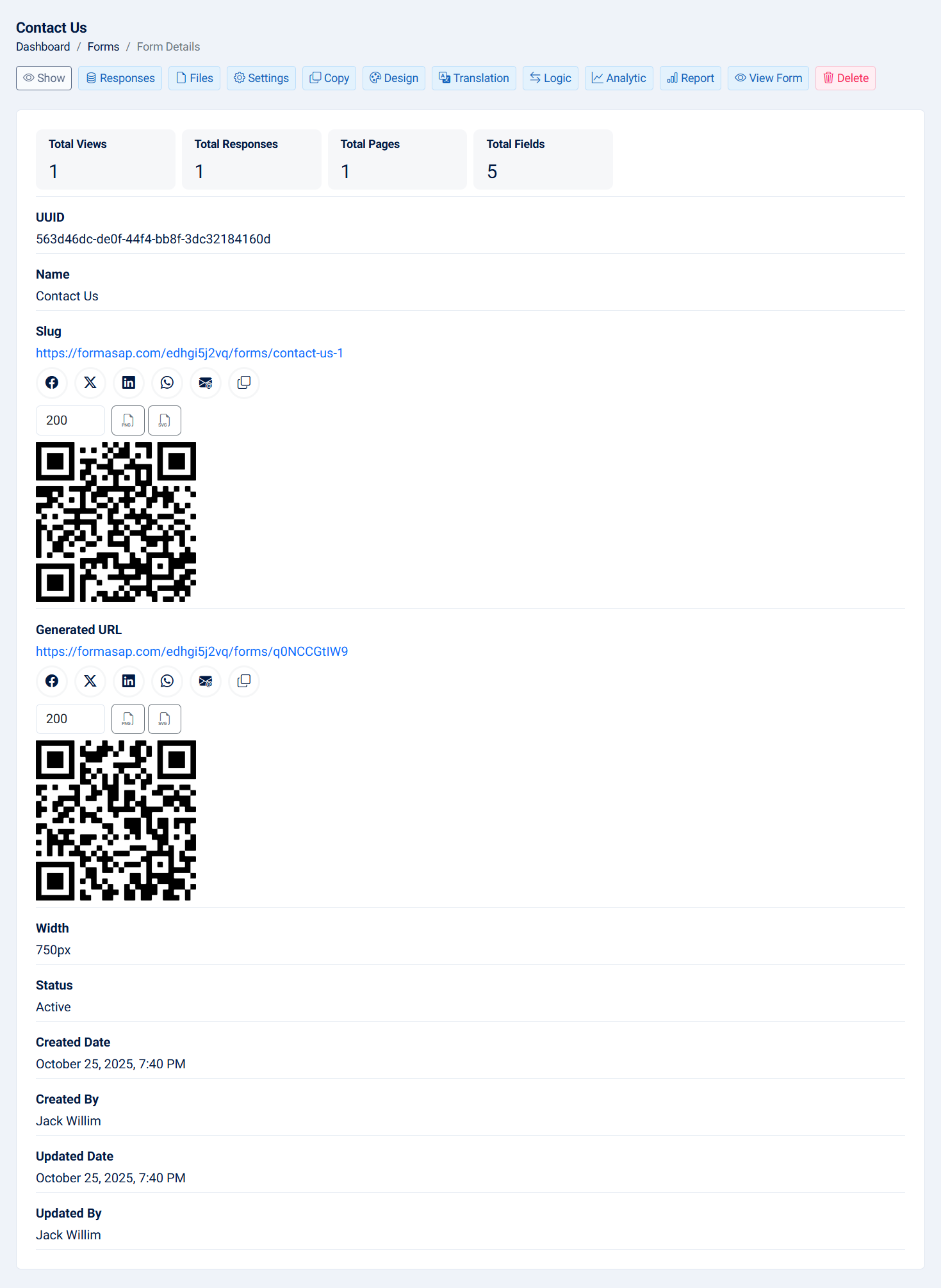
- UUID: The UUDI of the form.
- Views: To see who accessed the link via the slug or the generated URL, a cookie is used.
- Slug: The slug is a way to access the form, generated from the name to create a friendly URL. Under the slug, you can share it directly to Facebook, X, LinkedIn, WhatsApp, email, copy to clipboard, or iframe. You can also save the QR code and change its width, saving as PNG or SVG.
- Generated URL : The generated URL is a way to access the form, generated from the system itself. Under the slug, you can share it directly to Facebook, X, LinkedIn, WhatsApp, email, copy to clipboard, or iframe. You can also save the QR code and change its width, saving as PNG or SVG.
- Responses: To see the total number of responses.
- Pages: To see how many pages the form includes. By default, a form with one page will not have multi-step functionality.
- Fields: View the total number of fields that the form contains.
- Width: Form width.
- Status: The status of the form.
- Created Date: The created date of the form.
- Created By: The creator of the form.
- Updated Date: The updated date of the form.
- Updated By: The person who updated the form.
5- Responses: This action allows you to see the form responses with the ability to export data and customize the filter.
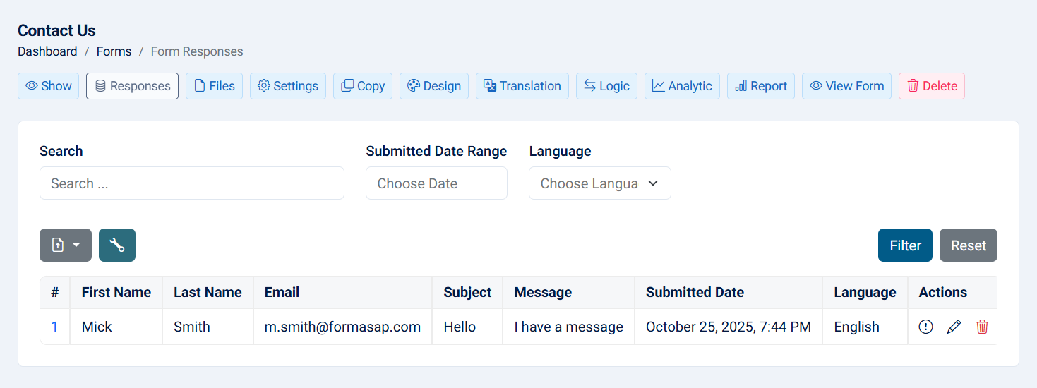
For each response you have the following actions:
- Show: To see the response details.
- Edit: To edit the response.
- Delete: To permanently delete the response.
Note: Dynamic filters will be available only for radio, checkbox, multi-select, select, and country fields.
6- Files: This action allows you to see the file(s) of the form if your form includes a file field, with the ability to export the files to a zip file or individually.

7- Settings: This action allows you to modify the form settings.
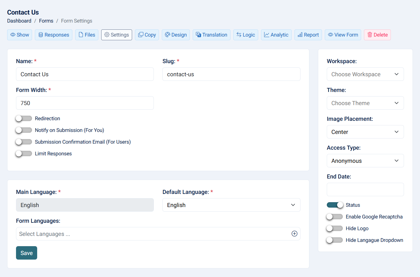
- Name: To change the name of the form. Changing the name dynamically updates the slug (required, maximum of 255 characters).
- Slug: To change the slug of the form, you can change the slug if it's not available, noting that if you change the name , the slug will change dynamically (required, maximum of 255 characters).
- Width: The default width is 750. you can change the width, enter the number without 'px' (required).
- Redirection Flag: If checked, a mandatory URL input will appear, redirecting the user to a custom page after submitting the form (URL must start with http://example.com).
- Notify on Submission Flag: If checked, four inputs will appear: one for the email subject and second for the email body. You can copy the field placeholders {} to show the field values in the email body and customize the email sent upon form submission. Third is to, you can send the email for certian email if this not sent , the email will be sent to default SMTP email, and last input is CC where you can add carbon copy to this email.
- Submission Confirmation Email: Similar to the notify on submission flag, but for users. When checked, three inputs appear: subject of the email, email body where you can add placeholders, and choose the email field. This is only for forms with access types anonymous and require password. For internal login, the user email will be used to receive emails.
- Limit Responses Flag: Limit the number of submissions and set a limit period (hour, day, week, month, year).
- Workspace: Change the workspace of the form.
- Theme: Change the theme of the form.
- Image Placement: When creating the form, the main system logo will appear above the form. You can choose the image direction (left, right, or center).
- Access Type: The form has four types of access:
- Anonymous: Users can enter the link directly without any authentication.
- Require Password: Users need to enter a password to access the form. Only those who enter the correct password can access the form.
- Require Internal Login: Users must have an account that can access the system in order to submit the form.
- Special Users: you can assign specific users to access the from.
- End Date: Set the end date and time for the form.
- Status: If unchecked, the form will be unavailable.
- Enable Google reCAPTCHA: Apply Google reCAPTCHA to the form. Ensure credentials are entered on the google settings page.
- Hide Logo Flag: If checked, hides the main system image on the form page.
- Hide Langague Dropdown: If you have a multi langanges form, you can hide the dropdown langague from form submission page.
- Main Langague: The main language of the form cannot be changed at this time.
- Default Language: When you have more than one language, you can assign a default language. When users access the link, the default language will be applied.
- Form Languages: When you select one or more languages, everything can be translated from the form's translation page, allowing you to create a multilingual form!
8- Translation: This action allows you to translate the form's default messages and field options, such as labels, placeholders, and more.
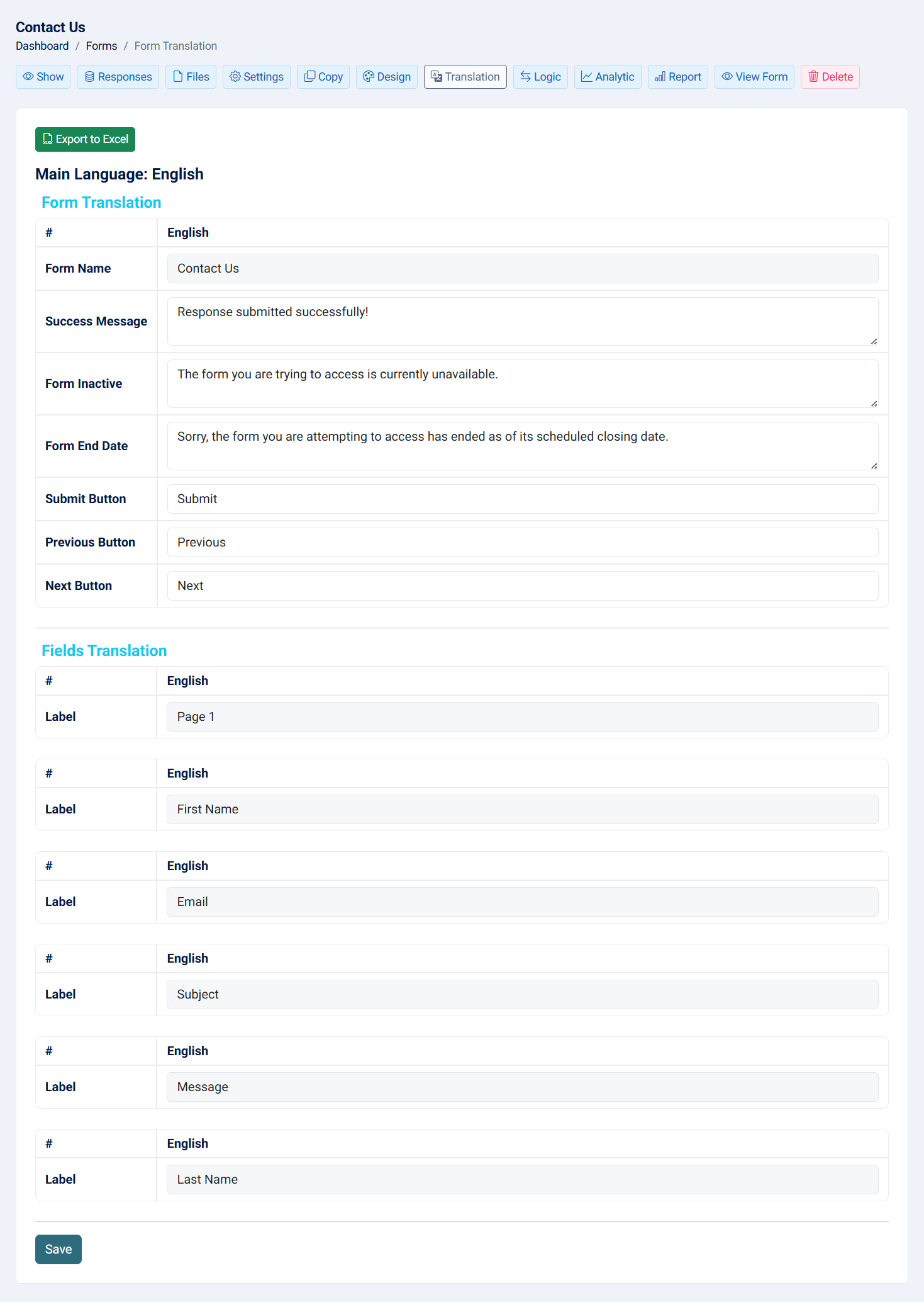
- Form Translation:
- Form Name
- Success Message
- Submit Button
- Previous Button
- Next Button
- Fields Translation:
- Label
- Help Text
- Placeholder
- Options
- Titles
9- Copy: This action allows you to duplicate an existing form and create a new one.
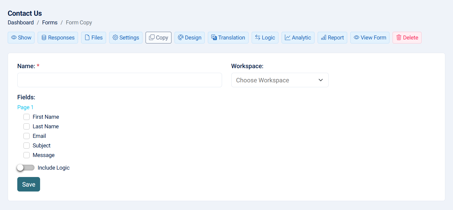
- Name: Enter the name of the copied form (required, maximum of 255 characters).
- Workspace: Choose the workspace; this is optional.
- Fields: Select the fields that you want to include in the new form.
- Include Logic: If checked and you copy a field that has logic, the logic will also be copied. Ensure that the target field is also copied.
Note: When you copy a form, the responses and form settings will not be copied.
10- Rules: This action allows you to show or hide fields based on conditions and values. If the value of the condition is met, the target field will be shown or hidden.
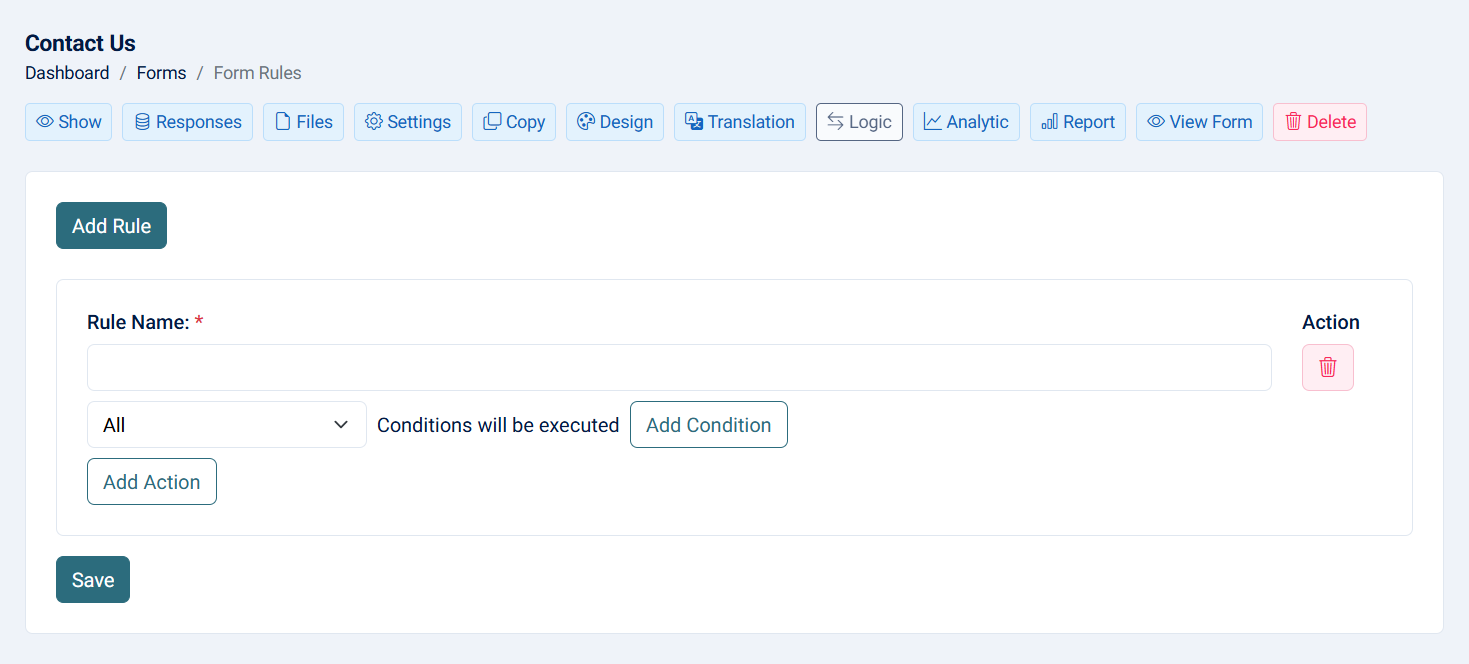
- Name: The name of the rule (required, maximum of 255 characters).
- Execution Type:
- All: all conditions must be met.
- Any: at least one condition must be met.
- Source Field: The field that contains the condition.
- Condition: The condition based on the field type.
- Value: The value that should meet the condition.
- Action: Show or hide.
- Target Field:The field that should be hidden or shown.
11- Analytics: This action allows you to view who view and submit the form as well their countries and browser type.
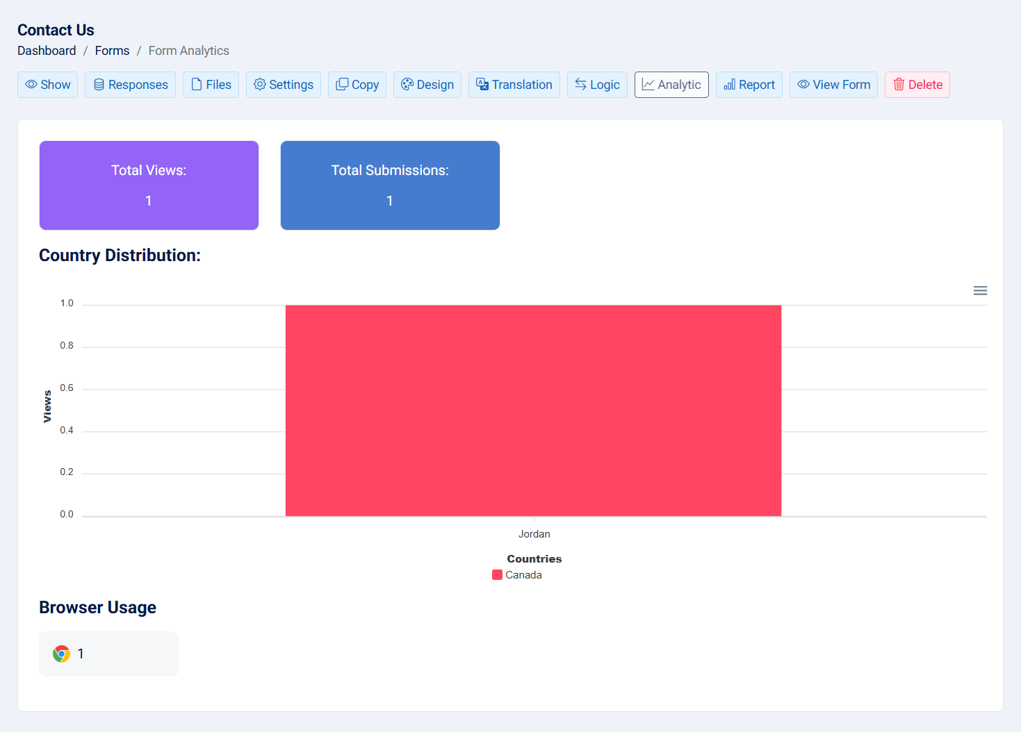
- Total Views: The total number of who viewed the form.
- Total Submissions: The total number of who submitted the form.
- Country Distribution: The viewed countries
- Browser Types: The viewed browser types
12- Report: This action allows you to view form analytics.
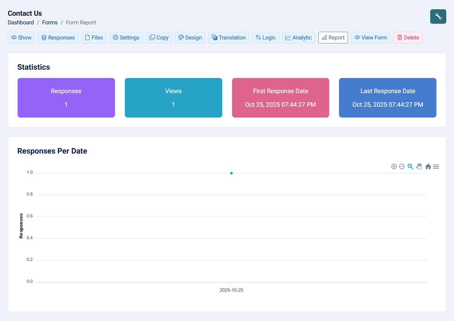
- Statitics:
- Total Responses: See the total number of people who viewed the form.
- Total Views: See the total number of people who viewed the form.
- First Response Date: Get the date of the first form submission.
- Last Response Date: Get the date of the last form submission.
- Responses Per Date: View a chart showing how many users submitted the form each day.
The following fields will have charts: radio, checkbox, select, multiselect, rating star, rating face, rating like, rating promoter score, country, relation and matrix.
When you click on the wrench icon at the top right of the page, a pop-up titled 'Personalize Report Configuration' will appear, where you can:
- Statistics Visibility: If checked you can hide the section.
- Responses Date Chart Visibility: If checked you can hide the section.
- Field Label Visibility: On the report page, fields of the same type will have a label, such as "Select Field(s)." You can hide this label if the option is checked.
- Zero Value Functionality: Hide values that have zero if checked.
- Form Fields:
- Alias name: Where you can change the field name on the report page.
- Chart Type: You can choose the type of chart—bar, pie, or doughnut—for all fields except the matrix.
- Hide: Hide the field chart from the page.
- Add to Statistics: Enabling this option will include this field in the statistics section. Each option will be counted and displayed separately.
13- Show: This action allows you to see the form with its generated URL.
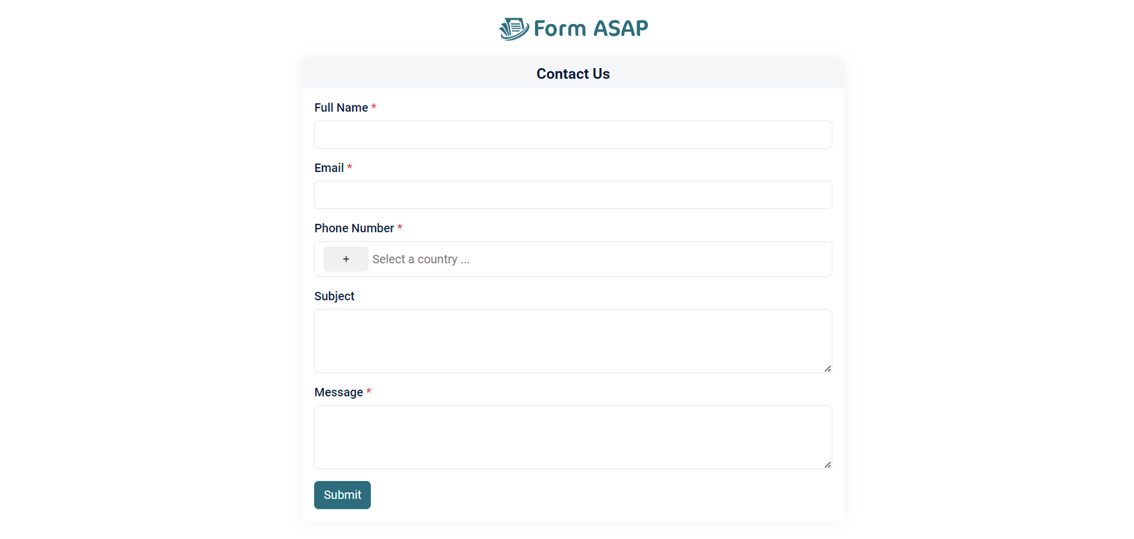

Note: ASAP branding will be available with the free plan.
14- Delete: The delete action allows you to remove a form. When a form is deleted, all associated data, responses, files, logic, and any custom certificates, documents, or calendars will be deleted.

Note: This action cannot be undone.
